
In the Mobile Web Design class, students learned more about HTML and CSS with a focus on mobile devices. Gone are the days of designing a web page the same way one would design a flyer. There is no longer the standard monitor size of 1024px by 768px. People are consuming content on multiple devices all with different screen sizes. Today, we are creating web pages that reformat to best fit the screen size being used. This is where Responsive Design comes into play. It can be quite challenging to think about. There are no definite measurements, but only relative measurements.
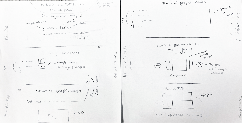
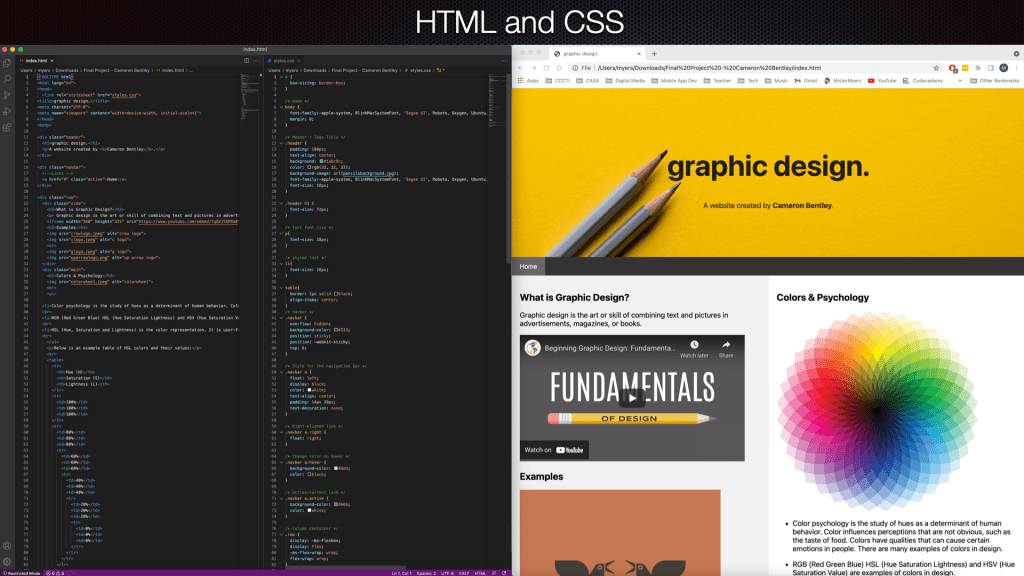
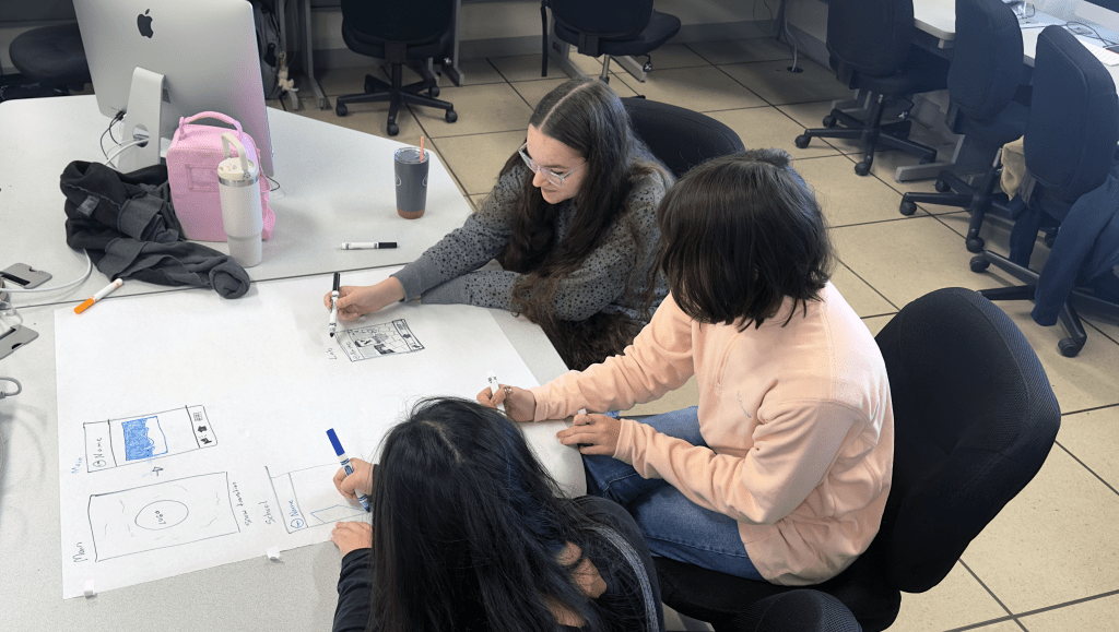
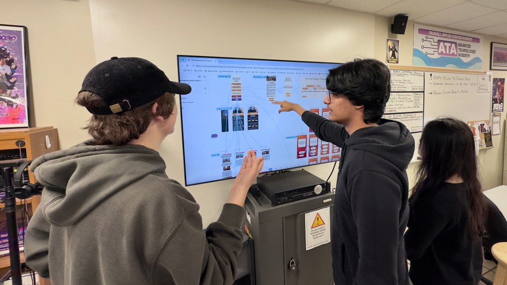
The students completed a variety of exercises and projects to learn more about HTML and CSS. They would use this new knowledge to complete the final project. For the final project, students created their own responsive web page from scratch. During the planning stage of the project, the students created a wireframe of their web page. These wireframes are similar to storyboards for a video. The final web page included HTML and CSS written by the student to create a web page that reformatted to different browser window sizes.
Currently, I’m working on getting a web server so the students can host their web pages. This would allow them to actually see their web pages on different mobile devices.
 Our Classroom Journey
Leave a comment